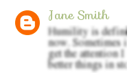
 I was quite pleased to discover a little trick while I was messing around with my blog template in the last couple of days. I had seen on a friend's blog that the comment avatars were little circles rather than the standard square shape. The circle was just really cute, and was one of those small touches that adds so much to a design, so I decided to add it to my own blog.
I didn't have any luck finding a tutorial to follow, so I fiddled around until I came up with the right combination and here it is!
1. Of course you begin every similar tutorial like this by going to the html editor of your blog, and downloading the template. That is unless you're like me (read: lazy), and don't. It's up to you.
2. Search for the following code:
.avatar-image-container {
3. Right under that, paste this code:
-moz-border-radius: 20px !important;-webkit-border-radius: 20px !important;-goog-ms-border-radius: 20px !important;border-radius: 20px !important;
4. Save your template, and go check it out! The preview won't work in this situation, because the comments don't show up on the home page.
Enjoy!
Ooh, this is handy! I can't wait to try it out! :D Thanks for writing up this tutorial -- you rock!
ReplyDeleteI'm getting a blog-redesign soon - I'll have to try this out! Thanks for the tutorial!
ReplyDeleteAwesome! Thanks for sharing=)
ReplyDeleteGreat one! But.. I can't find the code in my blog template's HTML codes. How's that? Thanks for this by the way. :D
ReplyDeleteJust wanted to let you know that I used your tutorial on rounded corners for my new design! I love it that you posted this around the same time I was working on my new template.
ReplyDeleteAlso just wanted to add for anyone having trouble, the original code didn't work for me, and instead of using the line with "avatar-image-container" I finally found a different code I had to start it out with. This is what I finally pasted into my code:
.delayLoad {
-moz-border-radius: 12px !important;
-webkit-border-radius: 12px !important;
-goog-ms-border-radius: 12px !important;
border-radius: 12px !important;
}
You'll notice that I changed my numbers, and this gave it more of a rounded square effect, rather than circles. Thank you so much for posting this tutorial!
Thank you so much for those added tips, Tarissa! It is a little difficult sometimes to translate these tricks to fit all templates. It looks great on your blog!
DeleteQuick and easy one.. Check this too....
ReplyDeleteShow Rounded Avatar Images On Blogger Comments